
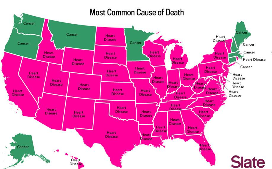
Earlier this month we featured a Centers for Disease Control breakdown of the most distinctive cause of death in each state. While that map showed the ways people died disproportionately across the country, several readers asked about the overall numbers. How did the most people die in each state?
That map wouldn’t be very visually interesting. The only two causes represented would be heart disease and cancer (you can see a map of that, designed by Slate’s Ben Blatt, here).
But Blatt went one step further and mapped the most common cause of death in each state besides heart disease and cancer.
Both maps are based on the most recent CDC reports on state-by-state mortality. Keep in mind that these numbers are from 2005, but the mortality tables page on the CDC site notes that there isn’t any data that’s more recent than this.
This map shows a bit more state-by-state variation by exhibiting three different leading death causes: respiratory disease, stroke, and accidents.
It’s not a life or death situation
Blatt’s rendition of the CDC data is of course a generalization, and not an actual predictor of your death depending on your state of residence. (Though his article title — “You Live in Alabama. Here’s How You’re Going to Die” — is confidently amusing). Everyone’s body is unique. But it’s still fascinating to peruse the data and share with your friends.
And if you’re a fan of maps, there’s much more where that came from.